For a long time I treated thumbnails as an afterthought.
I'd spend 12 hours editing a video, then 4 minutes slapping together a thumbnail right before publishing. Usually a screenshot from the video with some text on it. Sometimes my face making a confused expression. Sometimes nothing fancy at all.
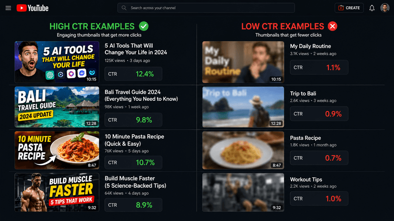
My CTR was sitting at 2.6% on average. For context, that meant out of every 100 people who saw my thumbnail, only 2 or 3 clicked. The rest scrolled past. The algorithm read that as "people don't want this video" and stopped showing me to anyone.
After roughly six months of treating thumbnails like a real part of the work, my CTR was averaging 7.4%. Same channel. Same content topics, mostly. The thumbnails were the variable that changed.
I've been on YouTube for over 5 years, and thumbnails are still the thing I test most aggressively. Building the YTKits analytics tool was my answer to a simple question: how can creators compare their video performance side-by-side? Now you can analyze engagement rates, estimated retention, and other metrics to see what actually works."
Here's what I actually learned, mostly by failing on camera over and over.
Why Thumbnails Are 90% of the Game
YouTube shows your video to a small test audience first. Maybe 100-1,000 impressions. If those people click at a healthy rate, YouTube concludes "people want this" and shows it to more people. If they don't click, your video dies right there.
Everything else you do, editing, content quality, even your hook in the first 30 seconds, only matters if someone clicks first.
The math is brutal once you internalize it. Under 3% CTR means your video is basically dead. Around 5% means you're getting some views but the algorithm isn't pushing hard. Over 7% means the algorithm is actively promoting you. Over 10% is viral territory.
The thumbnail is the single biggest CTR lever. The title is second. Everything else is downstream.
According to YouTube's official creator guidance, click-through rate (CTR) is one of the primary signals that determines whether YouTube recommends your video to more viewers. YouTube also emphasizes that thumbnails are critical for getting viewers' attention in a crowded feed.
What's Actually Going On Inside a Person's Head
When someone scrolls their YouTube feed, they're not really reading anything. They're triaging. Their brain is doing pattern matching in fractions of a second. Yes, no, no, maybe, no, no, yes, no.
For your thumbnail to get a "yes," it needs to communicate three things almost instantly.
What is this about? If the viewer can't tell within half a second, they keep scrolling. So clarity beats cleverness. A cluttered or ambiguous thumbnail loses viewers immediately.
Why should I care? There needs to be a hook. Curiosity, emotion, surprise, a question the viewer wants answered. The most effective thumbnails trigger an emotional response that makes viewers want to click. This is why successful creators test different designs — to see which ones actually get clicks from their specific audience.
Why should I trust this is worth my time? Production quality matters here, but also things like clear faces, professional layout, consistent style across your channel.
If your thumbnail nails those three, you'll get the click. If any one of them is weak, you'll get scrolled past.
What I Changed That Actually Worked
My biggest improvements came from a few specific changes.
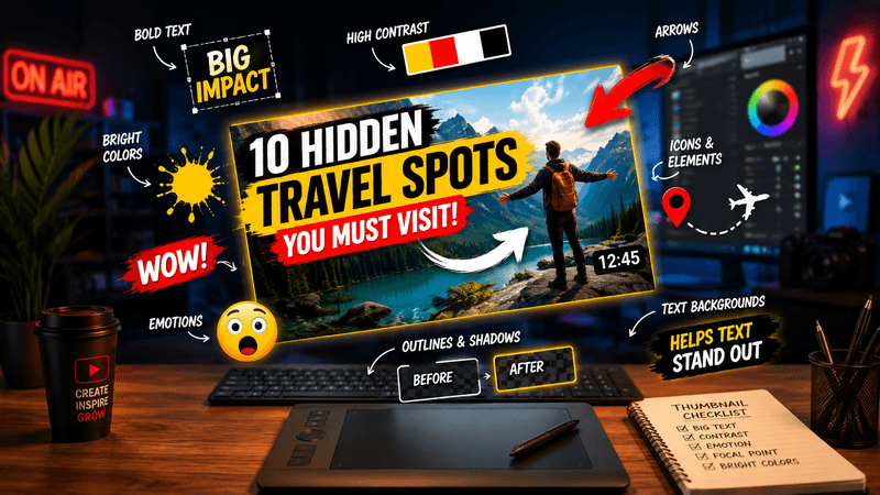
I made the main subject huge. Like, taking up 60-70% of the frame. Tiny stuff is invisible on mobile, which is where most of YouTube watches. If you can't make sense of your thumbnail when it's the size of a postage stamp, you've already lost.
I started using strong color contrast. My earlier thumbnails had a lot of muted tones, gray backgrounds, similar colors competing for attention. I switched to backgrounds with one or two punchy colors (saturated yellow, deep red, bright cyan) and made sure the subject popped against them. CTR jumped almost immediately.
I cut text to three words or less when I used text at all. Long titles on thumbnails are unreadable on mobile and just clutter the design. Now I either go text-free or use a single short punchy phrase, big and bold.
I started actually showing emotion on my face when faces made sense. Not the YouTube shock face, which has become a meme. Genuine, slightly exaggerated reactions that match the content. Excited if it's a positive review. Skeptical if it's a critical take. Confused if the video is about answering a confusing question.
I stopped using random screenshots from the video. They're always blurry, badly framed, and rarely capture the moment that would make someone click. Staged shots specifically for the thumbnail are way better.
The Styles That Tend to Work
There aren't really hard rules but there are patterns. Here are the styles I see working consistently:
Subject plus reaction face. Your face on one side showing emotion, the topic clearly visible on the other side, maybe a 2-3 word phrase. Works for reviews, reactions, tutorials, comparisons. Almost always the safe choice.
Before and after. Split the thumbnail in half. Before on the left, after on the right. Add an arrow or "VS" in the middle. Works incredibly well for transformations, comparisons, experiments.
Bold statement. Big punchy text taking up most of the thumbnail, with minimal background. Best for opinion content, hot takes, myth-busting. Has to be a strong statement to work.
Number plus visual. Big number ("7") prominent, with a clean visual of what the video is about. Works great for list videos and tutorials with steps.
Mystery hook. Show something interesting but incomplete. A box with something covered. A graph going up but cut off. Forces the viewer to click to see the full picture. Risky but high-CTR when it lands.
What doesn't really work as a consistent style: artistic minimalism, super clever metaphors that take 5 seconds to understand, dark moody designs (they get lost in feed), and anything where the main subject is small.
Mistakes I Made for Way Too Long
Stuff I did in my first year that I now know was actively hurting me:
Cramming too much into the frame. Two faces, three pieces of text, a logo, a date, the topic. The viewer's brain can't process it in half a second so they just skip. One clear subject, period.
Using the same exact layout every video. I thought consistency was good. It's good for branding, but if every thumbnail looks identical, returning viewers feel like they've already seen this one and scroll past. Vary something each time.
Tiny unreadable text. I was designing on a 27-inch monitor. Viewers were seeing it on a 6-inch phone. If your text isn't legible when the thumbnail is shrunk to 1 inch across, the text might as well not be there.
Faking emotion. The classic shocked-face thumbnail with the mouth wide open. Viewers can tell when it's performative. Genuine emotion or no face at all is better than a fake reaction.
Not testing anything. I'd publish a thumbnail and just leave it. If CTR was bad, I'd shrug and blame the algorithm. Once I started swapping thumbnails on underperforming videos and seeing the data shift, I realized how much room for improvement was sitting there.
Color Choices That Move CTR
This isn't preference. It's pattern recognition from looking at thousands of thumbnails.
High-performing colors: bright yellow, orange, cyan, lime green, hot pink. These pop on a feed dominated by other thumbnails and YouTube's red interface.
Low-performing colors: white backgrounds (blend with YouTube's UI), all-black thumbnails (invisible in dark mode), pastels, anything muted.
The strongest move is high contrast between subject and background. Dark subject against a bright background, or bright subject against a dark background. Whatever direction, just make the subject pop.
High contrast and saturated colors are fundamental to thumbnail design because they help your thumbnail stand out when displayed at small sizes alongside dozens of other videos. The color choices directly affect whether viewers will click or scroll past.
A useful test: scroll your own channel feed on your phone. Does your latest thumbnail stand out from the surrounding videos, or does it blend in? If it blends, your colors aren't doing their job.
Where to Actually Make Thumbnails
Tools that work well:
Canva is the easiest entry point. Drag-and-drop. Free for most things. Plenty of templates if you don't have design instincts yet.
Photoshop or Affinity Photo are the move once you want full control. Steeper learning curve but you can do anything.
Figma is what I personally use these days. Free for solo creators. Vector-based so designs stay sharp. Layouts and reusable templates are easy.
Pixlr is a free alternative to Photoshop that runs in the browser.
What you make them in matters less than how you think about them. A great thumbnail in Canva beats a mediocre thumbnail in Photoshop every time.
My Process for Each Video Now
Once I'm done editing, before publishing, I block out roughly 30 minutes for the thumbnail. Here's the actual process:
I think about what story the thumbnail needs to tell. Not the video's title. The thumbnail's job. Sometimes those are the same. Sometimes not.
I take a staged photo or grab a high-quality moment from the video that shows what I need to communicate. Good lighting, in focus, clean composition.
I open Figma (or whatever tool you use), drop in the photo, and figure out the layout. Subject placement, contrast colors, where text goes if I'm using any.
I add text only if it adds clarity. Three words max. Huge font. Strong contrast.
I shrink the design to mobile preview size and check if it still communicates clearly. If it's confusing at 1 inch wide, I simplify.
I compare to top videos in my niche by searching the topic on YouTube. Does mine stand out? If it looks like everything else in the feed, I tweak colors or composition.
That's it. About half an hour. The return on that time is enormous.
Testing and Iterating Is the Secret Move
Most creators publish a thumbnail and leave it for the life of the video. That's leaving so much on the table.
If a video underperforms in the first 48 hours and CTR is the obvious problem, swap the thumbnail. YouTube re-tests with the new one. I've watched videos go from 2.8% CTR to 8.4% CTR with just a thumbnail change, and the resulting view counts were dramatically higher.
YouTube also rolled out built-in A/B testing for thumbnails for some creators. If you have access to it, use it. Let YouTube tell you which design actually performs.
Even older evergreen videos benefit from periodic thumbnail refreshes. I've revived dead videos by giving them a thumbnail that matches my current style. The algorithm doesn't care that the video is two years old. It re-evaluates based on engagement signals, and a fresh thumbnail can spark new clicks.
The Bottom Line
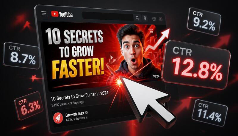
Stop treating thumbnails as a final-minute task. They're not. They're probably the single most important thing you make for any given video.
The basic checklist that has worked for me: one clear subject taking up most of the frame, strong color contrast that pops on a feed, minimal text or none at all, genuine emotion if there's a face involved, and design that's still readable when shrunk to phone size.
Test bad-performing thumbnails. Swap them. Watch what happens.
Your content might be the best in your niche. Doesn't matter if nobody clicks. The thumbnail decides if anyone ever gets to find out how good the video actually is.
Related Tools
- Keywords Extractor - Study what successful videos in your niche use
- Category Checker - Confirm your video category supports discovery
- Revenue Estimator - See how higher CTR translates into earnings
Sources & References
This article is based on:
- Personal testing: Analysis of making 1,000+ thumbnails for YouTube videos and tracking performance data
- YouTube Official Documentation: YouTube Partner Program eligibility and YouTube Creator Academy
- A/B Testing Methodology: YouTube's built-in thumbnail A/B testing tool and real-world thumbnail performance metrics